Case Study

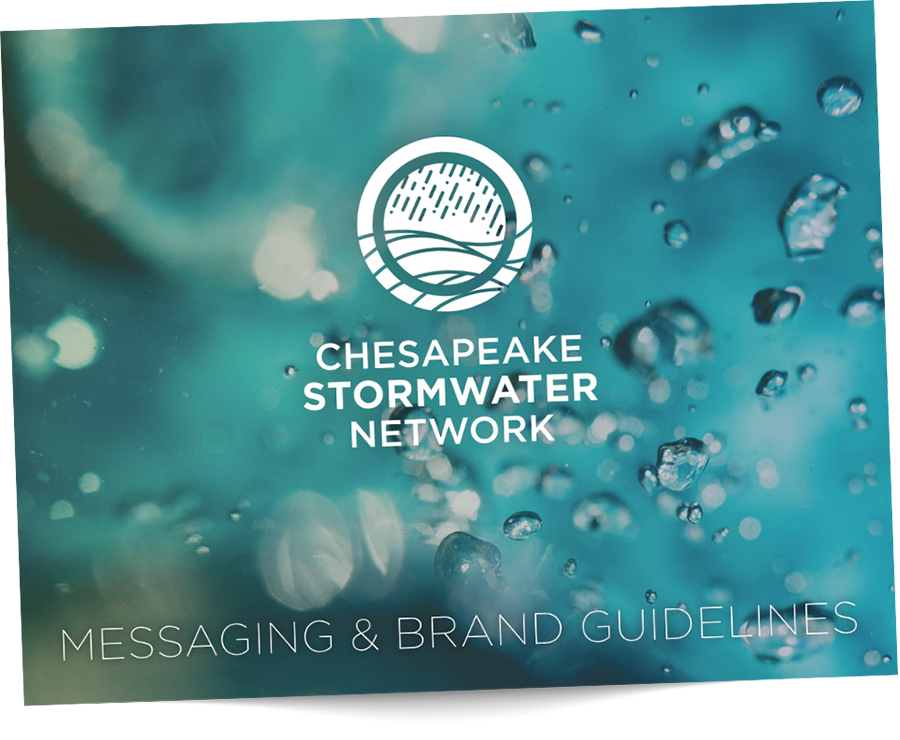
Sometimes, it’s just time for a refreshed brand. After all, where you start is not always where you land. For Chesapeake Stormwater Network, that was exactly the case. They reached out to us in hopes of evolving their brand from its current iteration, which was last finessed in 2009 — almost 15 years ago. It was clear from our very first conversation that our values and priorities were in alignment, which is an excellent place to begin.
Next up: visual expression! What we wanted to emphasize in the visual brand identity is the connection between rain and water to emphasize the stormwater element. We shifted from gray to green in the color palette to reflect moving from outdated mechanisms to green infrastructure in water management. And we chose graphic elements that evoke movement, to show how everything is interconnected and fluid — much like the Chesapeake Stormwater Network itself.
The team’s feedback was so invaluable throughout this process, pushing us to lean into our creativity. They were also just lovely and fun! And now, the organization’s purpose is much clearer: convening knowledge, people, and best practices dedicated to stormwater management and restoring the Chesapeake Bay.
More
Baltimore Healthy Start End of Year Appeal 2024
As Baltimore Healthy Start approached the end of the 2024 calendar year, we had an opportunity to think creatively about how we could garner fiscal support for the organization.
Child Resource Connect Website Design & Development
Child Resource Connect (CRC) had a website that wasn’t working for them, plain and simple. When they reached out to Sunny Side Creative, we were more than delighted to help.
Wilmer Eye Institute Centennial Campaign
From a refined centennial logo to cohesive materials for a gala, staff celebration, and public awareness efforts, every design element worked in harmony to reflect Wilmer Eye Institute’s Centennial Gala mission and impact.


